


Psychology of Color
Ever wonder why you like a certain color or avoid another? The psychology of color has been a topic of interest for years, and one of the earliest formal explorations of color theory came from the German poet Goethe, who in 1810 published Theory of Colours, a treatise on the nature, function, and psychology of colors.
But it wasn’t until nearly a century later when psychologist Carl Jung pioneered the field of color psychology that the concept of how color affects the human experience was given a scientifically authoritative voice. He said about the impact of color, “colors are the mother tongue of the subconscious.”
Research in more recent years has shown that color does in fact affect our physiology and emotions. What colors do we love most? According to various color research trends, blue is a consistent preference for about a third of Americans, green follows (around 20%), and then it drops to red and purple (a little under 10%).
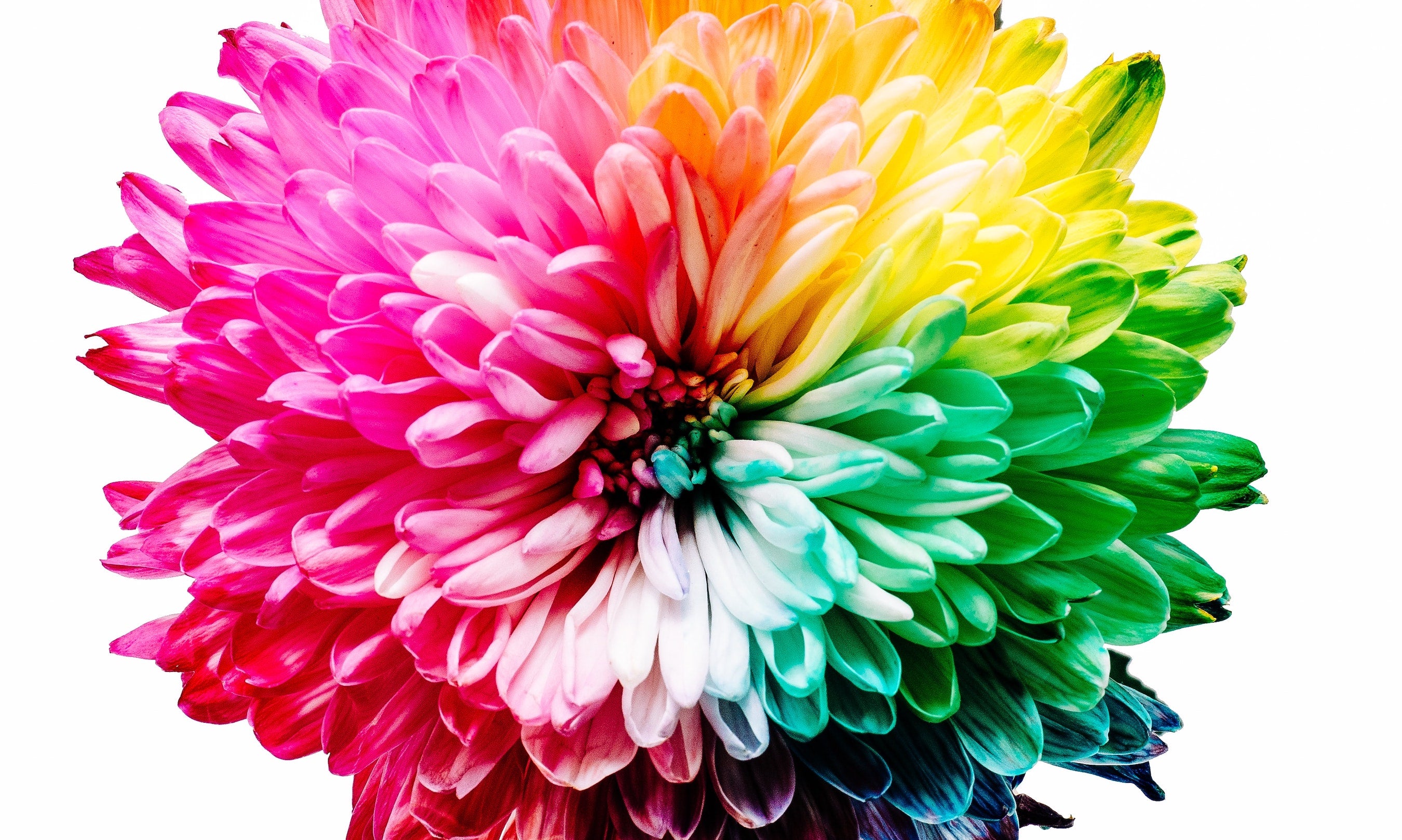
Following are some ‘colorful’ depictions of our color associations, embellished (in quotes) by Goethe.
Blue is described as peaceful, restful and cool; deeper shades convey order and more intense shades can be invigorating and energizing. “But as we readily follow an agreeable object that flies from us, so we love to contemplate blue -- not because it advances to us, but because it draws us after it.”
Green is the color of botany, the very essence of life. Green is friendly, dependable, soothing, and healing. Deeper hues have a prestigious association (because… duh, money.) “The eye experiences a distinctly grateful impression from this colour.”
Red is thought to be one of the most researched colors. It is provocative with positive and negative ends to a spectrum of associations. On the one hand, it can convey aggression and danger and on the other, passion and love. “I have known men of education to whom its effect was intolerable if they chanced to see a person dressed in a scarlet cloak on a grey, cloudy day.”
Purple rocks the personas of both its parents, red and blue. It ranges from contemplative and spiritual to sensual and regal.
Ah yellow; the color of sunshine is energetic and warm. For some, perhaps because of our traffic signals, it implies a cautionary state. It is also thought to stimulate creativity and confidence. “In its highest purity it always carries with it the nature of brightness, and has a serene, gay, softly exciting character.”
Long a meaningful color across various cultures, orange’s many shades draw numerous associations. Vibrant shades are uplifting, while peachey hues are inviting and sophisticated. “In looking steadfastly at a perfectly yellow-red surface, the colour seems actually to penetrate the organ.”
Of course, here at Clark’s Botanicals, we are all about green. Our packaging color is intended to reflect our relationship with botany and our commitment to our planet. We wish you a rainbow of happiness today! 🌈
Read more
Keep the 'Joy' in Joyous, by keeping the 'I" in Holiday
The holidays are out of the gate and for most of us, this is both thrilling and terrifying. Or maybe even just terrifying. Ironically, it's the season that’s meant to bestow love and spread joy tha...
Read more
Thriving After Surviving We have some exciting news! Wednesday, June 2nd at 10:00 a.m. ET, Clark’s Botanicals founder and CEO, Francesco Clark, will be appearing on the Tamron Hall Show. Tamron wil...
Read more
Leave a comment
This site is protected by reCAPTCHA and the Google Privacy Policy and Terms of Service apply.